1111111
Thinking about the ideal aesthetics for the design of your house? You should understand how the different colors can set the mood for the different rooms in a house. Take into account how much natural light each room gets and also consider which feelings you envision the rooms to emit. This is not solely about what colors you like best, but also about the overarching style throughout your home. But how can you mix and match personal style and color theory to achieve perfect balance? Here are some pointers that will help you in making these significant choices.
Key Takeaways
- Evaluate how much light the room gets and how you will use it to pick out colors that will boost the optimal mood and purpose of each room.
- Achieve a consistent design by selecting matching gold colors that have flow from one room to the other.
- Sample wall paint colors to test how they would look like against changing light conditions.
- On emotions, try bold and soft toned colors to set an inviting atmosphere.
- Make sure the colors reflect your style and the style put out by the existing furniture and decor.
Understand Color Theory
If you seek to appreciate color theory better, consider its principles as the basics of how colors make or break everything that is in a space. These principles will help you in the overall design of your home and what color scheme will work best for the space you want to color. Familiarizing yourself with the color wheel is the best place to begin. The color wheel shows primary, secondary, and tertiary colors. Red, yellow and blue are primary colors which mix to give secondary colors like green, orange and purple. Explore complementary color schemes, analogous schemes, and triadic schemes. Complementary colors sit opposite one another on the wheel; they yield excellent contrast when combined. This combination also makes a space energetic and vibrant. The colors that are next to each other are called analogous colors, and they are useful in making a calm and quiet environment. If you’re searching for balance, you can use a triadic scheme, which includes three evenly spaced colors on the wheel. That way, you can get both contrast and balance. Case in point, balance should also apply when we consider warm and cool colors: cool colors like blues and greens provide a sense of calmness while warm hues like reds and yellows can liven up a space. Now that you have these principles, you can check what style resonates well with you and the color scheme that works best for your home.Evaluate Your Area
When thinking of how to best choose a color scheme, the overall space should be evaluated first. Observe how natural light affects the area during various time periods of the day, how each room is utilized, and the existing decor of the places. These reflections will assist you in forming a congruent and welcoming environment.Assess The Room’s Egress Windows
There are many ways in which natural light can drastically shift the different styles of one’s home design and decor, so it is extremely important to analyze how light travels into each room throughout the day. Focus on checking the orientation of your windows. For instance, South facing rooms usually receive abundant sunlight and North prayer rooms tend to be on the cooler and darker side. Now to the latter, pay attention to time of day. Does light illuminate the kitchen in the early hours of the day or does the sun warm up the living in the afternoon? Also note how shadows shift into different positions when the sun moves as well. This will aid you in comprehending the overall light quality in the many different spaces. Additionally, take into account the shape and size of the room as well. For example, a small drawer like space can come off as more crainer and latent with darker shades, rather than larger outlined areas that can fulfill being taken over by deep and bold colors. Also consider nearby obstructions like trees or buildings and how they will drastically block the amount of light entering your house. Lastly, paint samples should be tested at differing points during the day while considering how the light impacts the space. This would confirm that the selected colors blend perfectly, improving the mood and tone of each room.Keep In Mind the Purpose of Each Room
The purpose of your house is also an important aspect to think about when determining the correct color scheme. A certain room can have a unique use, which can help inform your color selections. For example, when you are trying to create a cedar office desk, it would be good to consider using soothing colors like powder blue or mint green which enhance concentration. Meanwhile, yellow and orange can make a family room warm and inviting for get-togethers. Consider how your family interacts with each room throughout the day. Keeping a gentle reading corner in the house calls for warm inviting colors and sparkling clean white can elevate the kitchen. Remember the mood you want to project too. Muted shades in the bedroom tend to promote relaxation and a restful night sleep. Meanwhile, lots of color in a playroom can get children thinking and let their imagination run wild. Also think about the size of your rooms. Light colors tend to be more spacious in smaller areas while darker shades enhance a cozy feel in bigger spaces.Evaluate Existing Décor
Now that your floor plan is done, it is time to evaluate your exisitng décor. Sequence and jot down all the colors, patterns, and textures around you. This will assist you in assessing what was working and what didn’t, as well as if any standout pieces captured your heart. Lastly, translate your choice into words and think about how would you integrate those colors into your existing scheme. Next, move onto your overall style of your home. Is it modern, traditional, or perhaps a mix of everything? Remember, your color choices must compliment that style rather than compete against it. Try to find guidance from pieces like paintings or even furniture that you adore and that can steer your color choice. Not forgetting the natural light every room shines in, try to note which area is light. Brighter areas can introduce bolder shades while absorbing on the other hand can benfit from lighter colors. Lastly, think about the movement from one room to another. Colors that mesh well together can produce a harmonized feeling across your entire house. If you critically assess these details, you will be able to select the color scheme that matches your area and taste.Identify Your Taste
Identifying your taste is really important while picking a color scheme for your house. Before embarking on the journey of colors and tints, pause for a second and think about what is closest to your heart. Are you a fan of a clean, modern look, or do you prefer a more warm, countryside feel? Recognizing your aesthetic will help you narrow down the colors you choose. After, draw colors and images from different things, for instance, magazines, Pinterest or even the outside world. Design a collage that represents colors, textures, and patterns that inspire you. This collage will serve as a visual reminder that your color scheme should match your style. Finally, think about how different colors change the mood of a room. If you want to create a calming atmosphere, light shades of blue or green should do the trick. Bold colors like red and yellow infuse a space with energy. And in the end, look at the flow of your house. The colors used in every room should exude balance and still reflect your personal taste. Once you have a rough idea, you will easily narrow down a set of colors that best suit your personality.Think About The Effects of Lighting
 The kind of light you use will tremendously change the colors in the room. It affects your mood and general perception of the room. While working on the color scheme, ensure that you consider the type of light in each room. Incandescent bulbs, fluorescent bulbs, and warm lights all give off different tones and can radically change how your selected colors appear.
Colors seem to be more bright and lively in places with sufficient amount of natural light. An example would be vibrant blue which feels more refreshing in the sunlight but looks dark behind artificial light.
Conversely, in places that lack any natural light, it is best to opt for light shades to give an open and airy feel.
Moreover, think about how each color interacts in natural light during morning and afternoon. A space that gets direct light in the morning will appear to be different in the afternoon. Check the color folk at different times of the day to see how they interact with the light.
Make sure you don’t forget to consider the lights and lamps you will be using. Earthy tones will be highlighted through warm lights. On the other hand, cooler tones will give off a modern feel to the room.
These techniques will ensure the beautiful appearance of the room in every light setting.
The kind of light you use will tremendously change the colors in the room. It affects your mood and general perception of the room. While working on the color scheme, ensure that you consider the type of light in each room. Incandescent bulbs, fluorescent bulbs, and warm lights all give off different tones and can radically change how your selected colors appear.
Colors seem to be more bright and lively in places with sufficient amount of natural light. An example would be vibrant blue which feels more refreshing in the sunlight but looks dark behind artificial light.
Conversely, in places that lack any natural light, it is best to opt for light shades to give an open and airy feel.
Moreover, think about how each color interacts in natural light during morning and afternoon. A space that gets direct light in the morning will appear to be different in the afternoon. Check the color folk at different times of the day to see how they interact with the light.
Make sure you don’t forget to consider the lights and lamps you will be using. Earthy tones will be highlighted through warm lights. On the other hand, cooler tones will give off a modern feel to the room.
These techniques will ensure the beautiful appearance of the room in every light setting.
Discover Different Color Harmonies
When determining the best color harmonies to use, you will figure out how various color tints can be blended in your space. It is important to learn about different harmony blends in order to create an appealing and welcoming space. Start off by looking at complementary colors. These colors appear directly across on the color wheel. It produces a strikingly vivid mix that adds life to the room. Next, consider analogous colors. These are next to one another in the color wheel and create a much calmer and pleasant atmosphere. Using blue, green, and teal is considered a great blend, especially for a peaceful setting such as a bedroom or living room. For a more daring but refined look, try using triadic colors. This is achieved by picking three colors that are situated evenly apart on the color wheel. Like red, yellow, and blue. This method helps to maintain balance in the color palette and still makes it interesting. Lastly, remember to try out monochromatic schemes. This is using a single color but in different tints and shades. This method ensures that the scheme stays fresh but at the same time maintains banner simplicity.Try Color Samples
To start off, it is best to apply the color samples on one wall and add them to different parts of the space once you finally decide on your color options. Swatches should be applied in a variety of places to observe how they change with time as lighting can alter their look drastically. This step allows you to make an informed decision before fully committing to painting over a given surface.Swatch Samples Like A Pro
To achieve the best result for how color portrays the space you wish to paint over, you have to sample swatches like a true professional. Start by narrowing down your choices to your two or three favorites. A wider selection will cost you more time and effort in the subsequently required steps. Make sure to grab small sample pots or swatches from your local paint store. Understand that detail might look appealing on a paint chip but looks horrible on a wall. Next, apply the samples directly on the wall or on a poster board. This gives you a rough idea of how the end result will appear in your house which can differ from your initial assumptions. Don’t forget to apply more than a single layer when painting, as the result might not be consistent across the surface due to different application techniques. Finally, we want to see how these samples clash with the rest of the room’s furniture or decor. From here, we are able to have a wider understanding of how it would appear at different times of the day. You may be surprised by how differently lighting affects color. You can now live with your samples for a few days. Consider how you view each color as you circulate the space. This will instill you with the confidence to select the perfect color scheme for your house in a way that you will love for a long time.Lighting Impact Assessment
While testing color samples, color assessment in home interior design should always remember how natural and artificial light can dramatically change colors. Always remember that when working with artificial light, the colors in your home will look different. You should always make a review of your color choices throughout the day, as light can shift hues. Make a highlight of your notes to the frameworks and describe what you experience. Here are a few effective steps to help you assess lighting impact when testing colors:- Time Tracked Samples: Look at your samples in the morning, afternoon, and evening. Note the color patterns as the sun rises.
- Field-Trial: Test the samples in incandescent, fluorescent, and LED light to see how each type of light will affect the colors.
- The Hunt for Undertones: Look for undertones of light colors. Give warm undertones warm light while cooler light can emphasize cool undertones.
- factor in the function of the room: Consider how the room will be put into use. Soft shades would work well in a comfortable living room whereas a bright kitchen may benefit from cooler colors.
Maintain A Unified Overall Style To The House
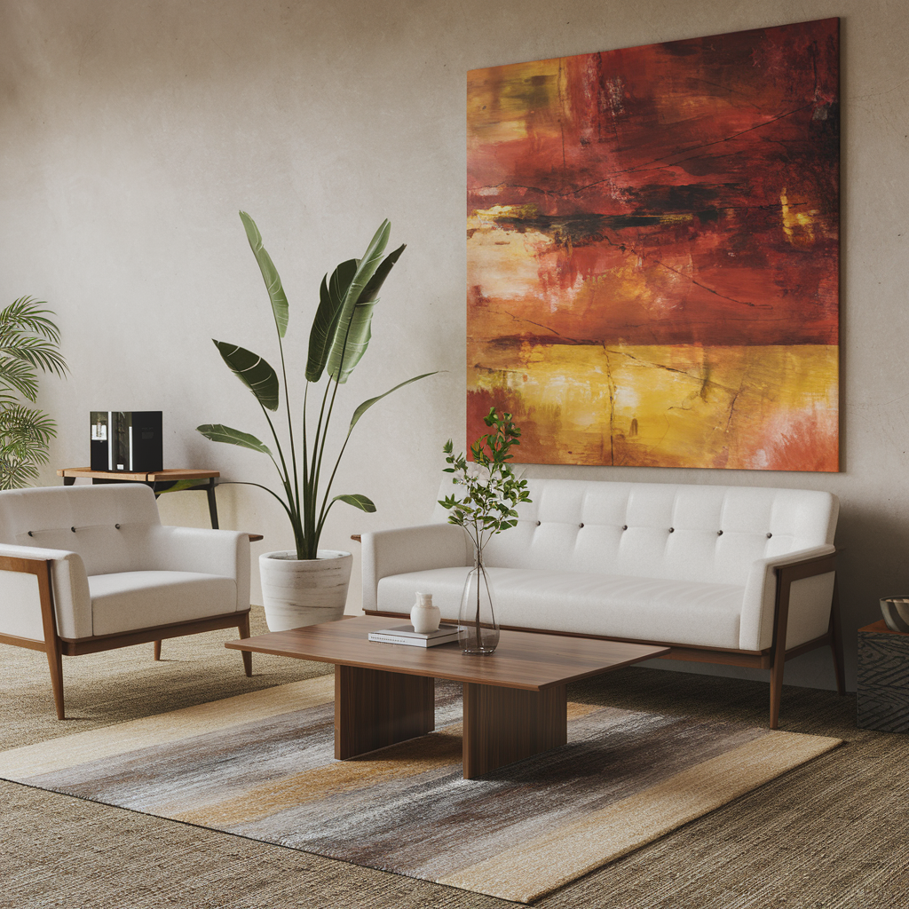
In your entire house, make sure that there is a cohesive look, which is important to maintain an overall feel. Make sure to choose a color palette that array from all the rooms to all the rooms. Maintain a few main colors and play around with different shades and tones of those colors. This gives a unified feel to the entire house while allowing some form of self-expression in each room. Also, consider the furniture, decor, and accessories that you are going to use. Choose pieces that are much more than just color matched, but also work with each other stylistically. For example, if you selected an ornate dresser is a modern aesthetic room, make sure that the style of the dresser does not clash with your vision. Cohesion works on texture also. Add depth to your design by mixing wood, metal, and fabric while keeping your color palette. Patterns should be incorporated carefully so that they enhance your design without coming off as overpowering. Finally, remember to connect your spaces visually by using similar hues in adjoining rooms or placing decor pieces that repeat your color scheme throughout the house. This deliberate technique produces an amazing flow where every room becomes shoulder to shoulder with a well-designed whole.Conclusion
However, color scheme is best defined as a blend between art and science. Choosing the perfect color scheme for your house is the hardest of tasks. Bold colors enrich energy, whereas soft tones bring calmness to the place. By blending these contrasting ideals, you achieve an energetic yet calm, soothing environment. The interplay of colors gives each room the chance to express your personality. It’s not just about good looking objects, but a sanctuary that feels like home to you. So, go crazy and empower your house to become a piece of art.-
What are the best color schemes for small rooms?
Light, neutral tones like whites, soft greys, and pastels work best for small rooms. These colors make spaces feel larger and brighter.
-
Can I use dark colors in my living room?
Yes, dark colors can add sophistication and warmth. Use them in moderation or combine them with lighter accents to prevent the room from feeling too closed in.
-
How do I choose a color palette for an open-concept space?
Stick to a cohesive palette with complementary colors. Neutral tones for walls with accent colors in furniture or décor can tie the space together.
-
Should I consider the room’s function when picking colors?
Yes, the function matters. Soft blues or greens are calming for bedrooms, while energizing yellows or oranges are great for kitchens or home offices.
-
How can I add color without overwhelming the space?
Use accent walls, colorful furniture, or accessories like pillows and rugs. This allows you to introduce color without making it too dominant.